Reduce user's churn during onboarding
Summary (TL;DR) I redesigned the complete onboarding experience of OdeCloud applicant to reduce uncertainty, churn, and incomplete profiles on the platform.
More complete profile across our 600+ users helps making clients more interested.
Role
Lead UX/UI Designer
Industry
Saas for ERP consultants
Company
OdeCloud

Initial challenge: Incomplete users profiles reduce clients interest, and attracts less new consultants.
Goals
Reduce users churn during consultant applications and onboarding.
Make the application phase seamless, easier and warmer than the current typeform.
Help new consultants discover the platform and filling their profile after signup.

1. Asking users for info and permissions just when needed.
Asking users for info and permissions just when needed is associated with up to a 28% increase in acceptance rate. And presenting steps when they are needed, not all at once, increase user's trust.

That's why we only ask for phone number during the formal signup and not during application for example. As we do not call during this process, but we need it for vetted users, it reduces the large number of steps at once, and feels less like all-information gathering.
It also allows us to propose a 2min applying time to everyone, which is attractive for applicants with little free-time.

2. Make it predictable
When our users recognize the branding and UI across the steps, know the remaining time to complete a long task, they are more prone to complete it.
That's also part of the UI copy, you should help your users understand what they are doing, instead of "Give us this", say "Let's find out this" or "We're gonna do this.".
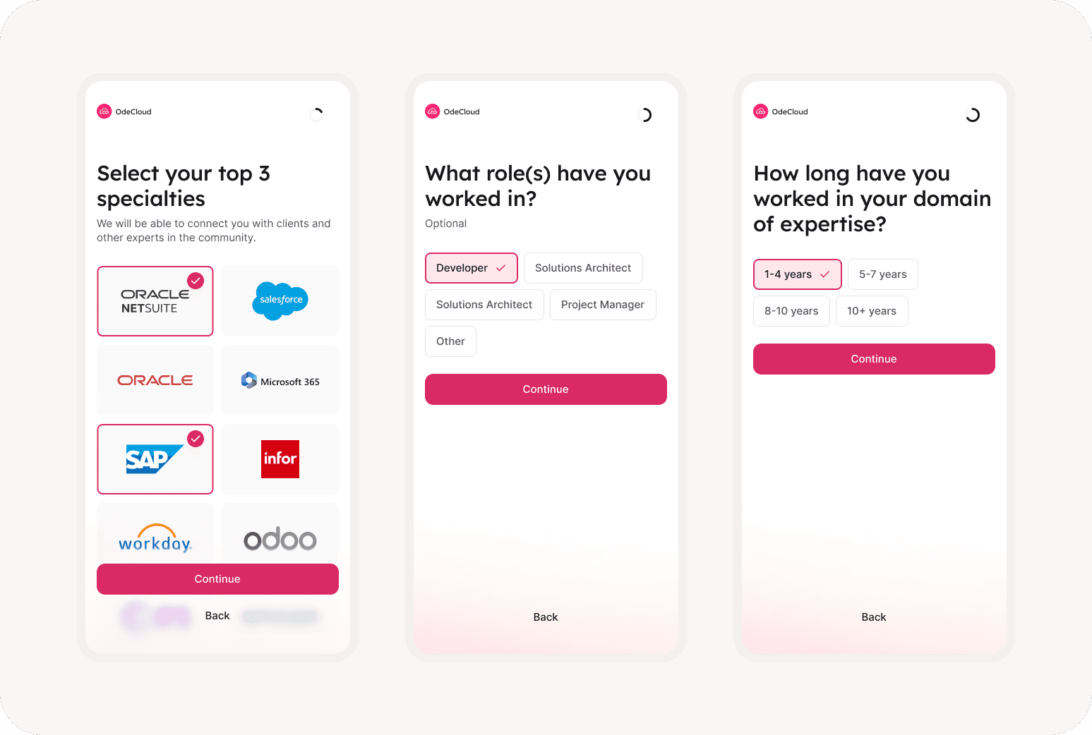
3. Avoid repetitive tasks

4. Facilitate verification stage
Instead of making them verify every information they entered, we used our AI to build a short summary of each user application, to review before they submit.
It's rewarding, reduces effort for user and still reduce error rates.

5. Already making them feel part of the community
There is many ways to make an onboarding more human, I think it goes beyond the form they fill, every user get to see a welcome video from our CEO when they sign in.
It's warmer for them, and we can give them more information they didn't read when they were texts.
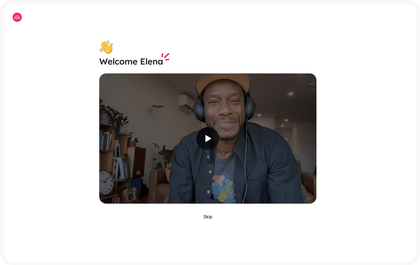

6. The onboarding continues after, with gamification
One of the goal is to have more complete profiles on the platform.
Which is against asking more to users directly when they sign up, so we allow minimum information during the formal onboarding sign up.
Then we motivate them to fill the profile with gamification, nudges and we are also transparent with the fact that a poorly filled profile gets less attention from clients.


Some metrics and estimated impact
+25%
Start-to-submit completion rate
5.3 minutes
Avg. time to complete application
~85%
Profile completion at day 30
-18%
Error requiring manual follow-up
Thanks for reading, you might like these projects:
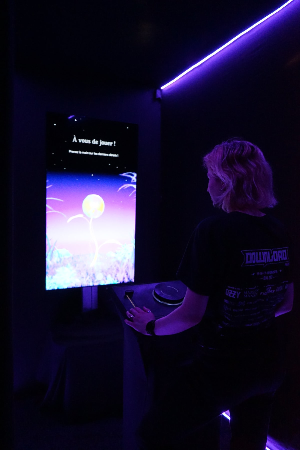
Hanami is an interactive installation that aims to promote cultural places by creating a poetic experience that links museum and parc visitors.
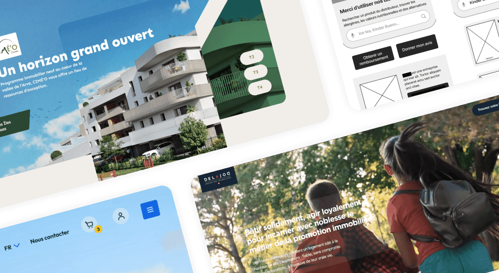
Building website and e-commerce platform in agency since 2021. From strategy to iteration and handoff, I work in a systemic & creativite way to find the right designs to reach business goals.
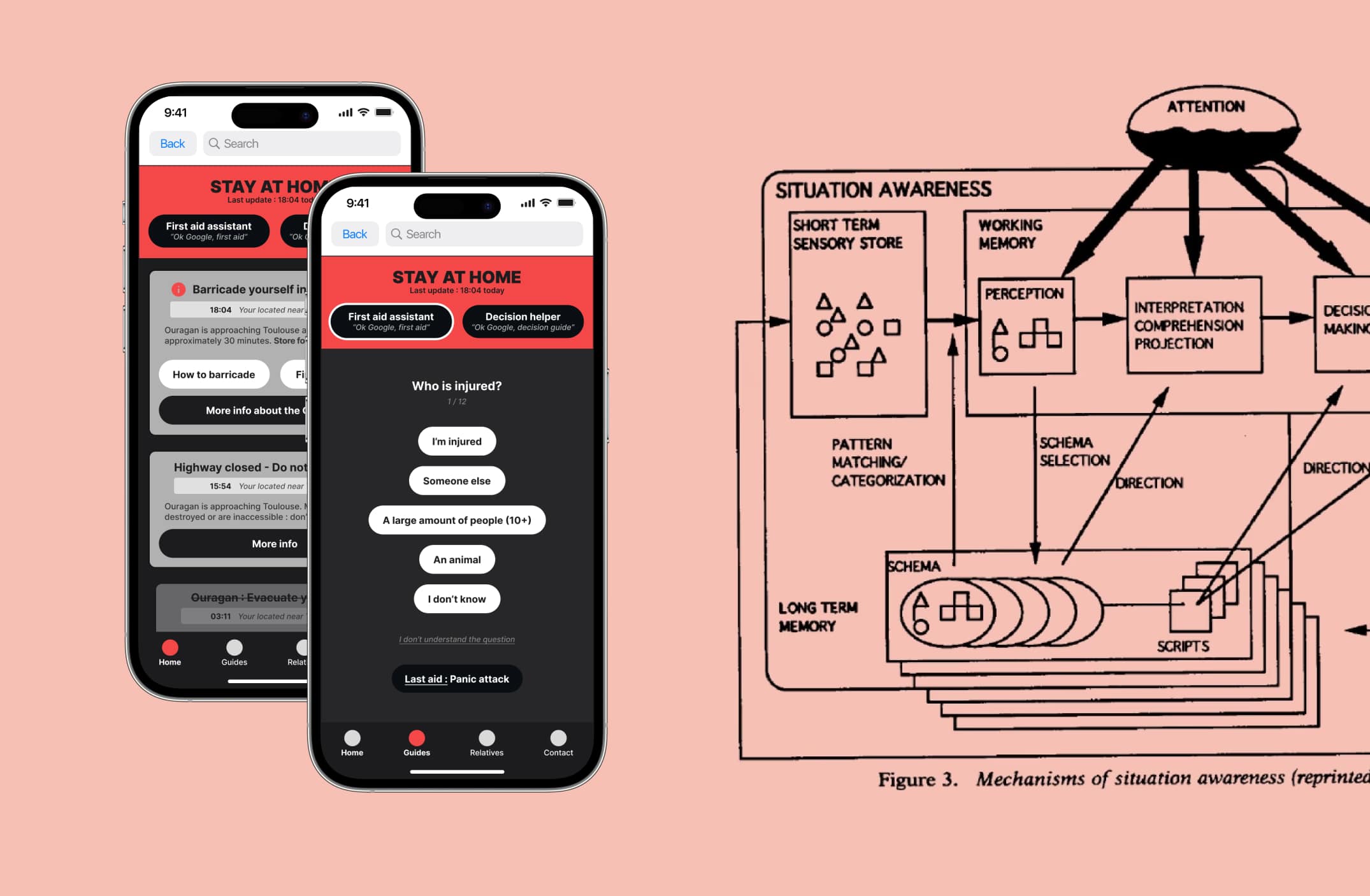
For my graduation thesis, I asked myself "Can UX design help manage natural disasters in France and around the world? If yes, how?"